Transforming an interior is not just about choosing a new sofa or repainting a wall in off-white. The most successful projects articulate three levers that are rarely addressed together: the thermal performance of the building, the coherence of materials, and the management of natural light. Since September 2026, the reform of MaPrimeRénov’ has reshuffled the cards on the energy aspect, which directly influences the decor and renovation decisions.
MaPrimeRénov’ Reform September 2026: What Changes for Your Home Project
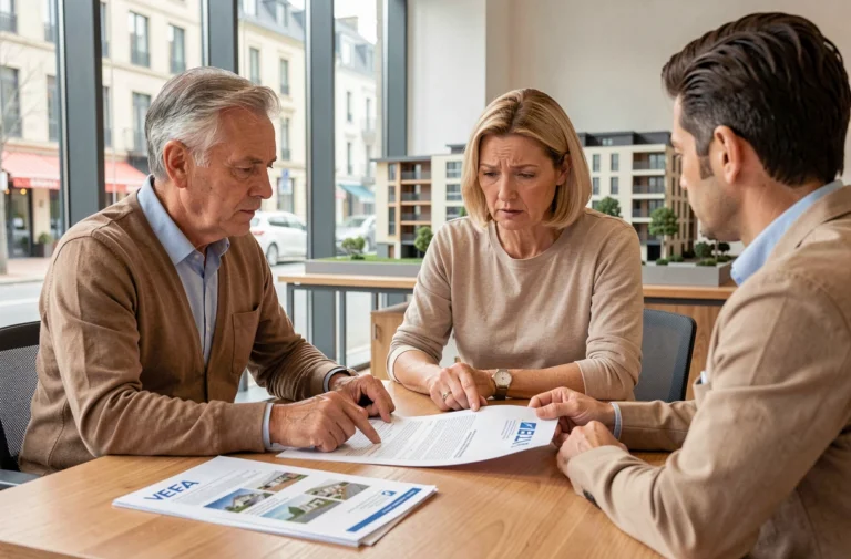
The decree n° 2026-822 of August 25, 2026 has removed the majority of works eligible for the “gesture” pathway. Isolating attics alone, replacing windows, ventilation, thermodynamic water heaters, or wood stoves done in isolation no longer qualify for aid. Funded projects now include heating heat pumps, connections to a heat network, the removal of an oil tank, and, under certain conditions, energy audits.
For professionals in the sector, this shift towards comprehensive renovation changes the sequence of works. We recommend planning the thermal envelope (insulation, joinery, ventilation) as a single package before touching the interior finishes. Separating these items means paying twice for the restoration of the surfaces.
The order of August 17, 2026, adds an additional constraint: an aided extensive renovation must lead to decarbonized heating, excluding gas and oil. In practical terms, if you plan to redo your living room and the gas boiler supplies underfloor heating, the generator change must be integrated into the project to access the aids. By browsing Mulot Bricole’s home universe, you will find technical sheets detailing the equipment compatible with these new requirements.
Material Coherence and Color Palette: A Method for a Sustainable Interior
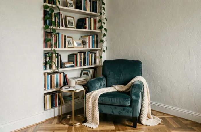
A successful interior relies on a limited number of materials. We observe that the most harmonious projects combine no more than three or four in the same room: one wood (oak, walnut, ash), one metal (brass, brushed steel), a dominant textile, and possibly a stone or polished concrete.
Selecting a Color Palette Without Overwhelming the Space
The 60-30-10 rule remains a reliable guideline. The dominant color covers walls and large surfaces, the secondary dresses the main furniture, and the accent color appears in touches on textiles and accessories. This ratio avoids the trap of “overload” caused by accumulations of patterns without hierarchy.
The choice of colors influences the perception of volumes as much as lighting does. A saturated hue on a load-bearing wall creates a focal point that visually shortens the room. Conversely, a muted tone on the side walls expands the perspective. The finish matters as much as the hue: a matte finish absorbs light and masks imperfections, while a satin finish reflects it and enlarges the perceived space.
Textiles and Coatings: Thinking in Layers
The layering of textiles (curtains, cushions, rugs, throws) structures the ambiance without touching the major works. Three points to check before purchasing:
- The maintenance compatibility: a washed linen at 40 °C does not coexist well with a dry-clean-only velvet if you want to harmonize the washes
- The density of the weave for rugs, which determines longevity in high-traffic areas (entrance, hallway, living room)
- The UV resistance for curtains exposed to full south, to avoid fading in a few seasons
Natural and Artificial Light: The Most Underestimated Lever in Interior Decoration
Light transforms a space more radically than a change of furniture. A north-facing living room with cold white walls will always appear dull if the artificial lighting consists only of a central ceiling fixture.
Multiplying light sources at different heights changes the perception of an interior in just a few hours. An effective lighting plan combines at least three levels: general indirect lighting (LED strip in a cornice or diffusing pendant), functional lighting (reading lamp, worktop spots), and ambient lighting (table lamp, adjustable wall sconce).
Color Temperature: A Technical Parameter That Changes Everything
We recommend not mixing color temperatures in the same living space. For a living room, a warm white between 2,700 K and 3,000 K is suitable for relaxation. For an office or kitchen, a neutral temperature around 4,000 K promotes concentration and the rendering of food colors.
Improperly calibrated lighting negates the effect of a carefully chosen color palette. A bulb that is too cool makes beiges look green and yellows look gray. Testing bulbs in the target room at the usual time of use avoids unpleasant surprises after installation.
Interior Renovation: Balancing Decoration and Energy Performance
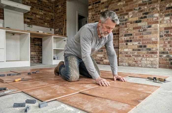
Home improvement projects benefit from being thought out in this order: thermal envelope, then networks (electricity, plumbing, ventilation), then finishes and decoration. Reversing the sequence generates additional costs and rework.
Since the reform of September 2026, a prior energy audit has become strategic even without regulatory obligation. It allows for the identification of thermal bridges before installing an expensive wall covering that will need to be removed if insulation is addressed later.
- Check the current DPE rating of the property to anticipate potential rental bans (progressive schedule already in place for thermal sieves)
- Prioritize works that combine energy savings and improvement of indoor comfort: interior insulation with finished cladding, replacement of joinery with integrated aesthetic choices
- Integrate the change of heating system from the design phase to avoid having to intervene after finishes
Improving a home is about the order of interventions, not their accumulation. A well-sequenced project that articulates thermal performance and decorative choices from the outset produces a more coherent and sustainable result than a series of independent whims.